
Special thanks to vgmdb, SEGADriven, and Sonic Retro for all of these pics. I tried to get the highest quality scans available and they were a godsend.
I don't see something like this talked about, and in some cases stuff like this is not properly archived, so you must bear all of my nonsense babble about discs now. Some of these are pretty fucking cool so it's a win win situation from my perspective. Oh, and there are no singles (yet). All of this was already so much work so I'm leaving it for later. No vinyls too, discs only.
Ratings don't mean anything besides that I feel that is one is a 4.
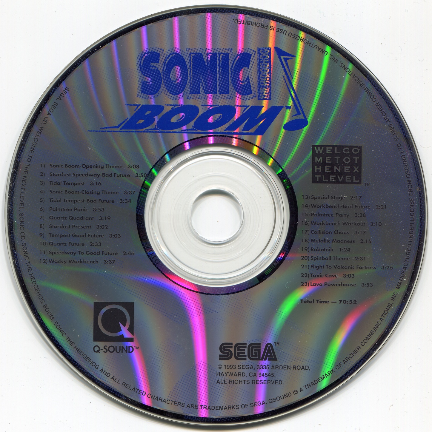
No not the game or the cartoon, the song. This disc contains some Sonic CD (US) and Sonic Spinball songs. The content doesn't matter though. This disc is pretty plain and boring, though I appreciate that cool "WELCOME TO THE NEXT LEVEL" a lot. Also, it was the first, bonus points for that.
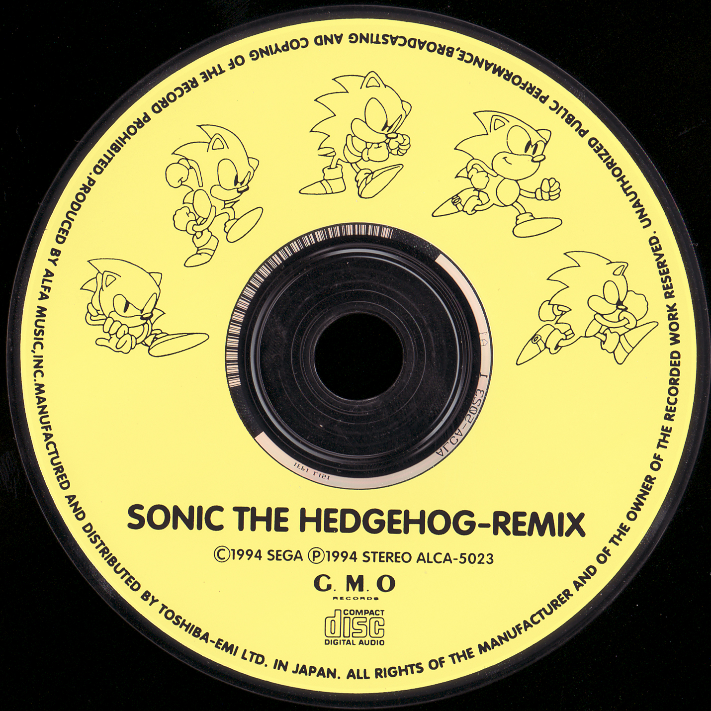
Ok this one is cool as shit. I missed cool classic Sonic. He is allowed to be cute, just look at the 4th one, but I just missed this guy being plain cool sometimes. Just very stylish art, pleasant color scheme too.
Plain and boring.
Pretty sleek and clean, but still boring.
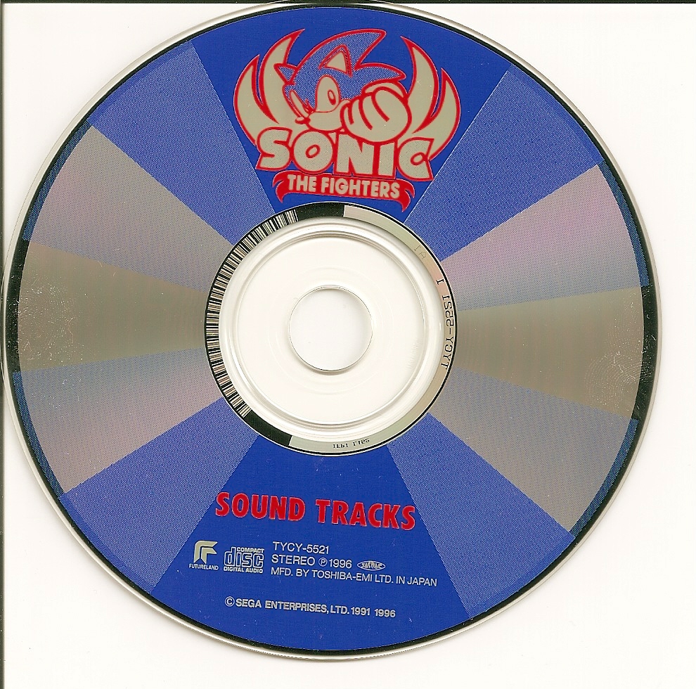
Cool logo but ugly as sin. What the hell are those colors.
Don't let the name fool you, just contains remixes and songs like "They Call Me Sonic", oh god that one. Boring too but at least the color scheme fits.
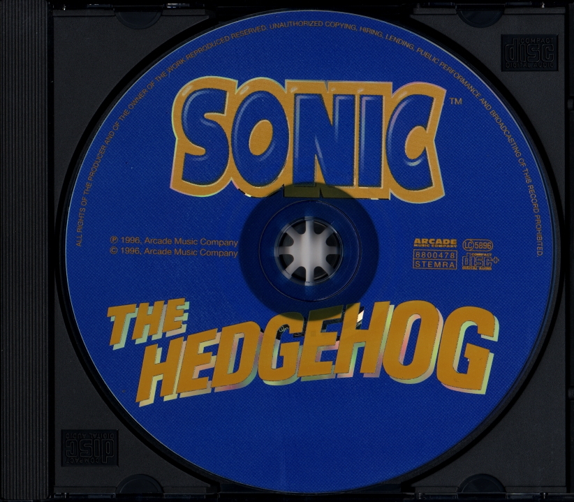
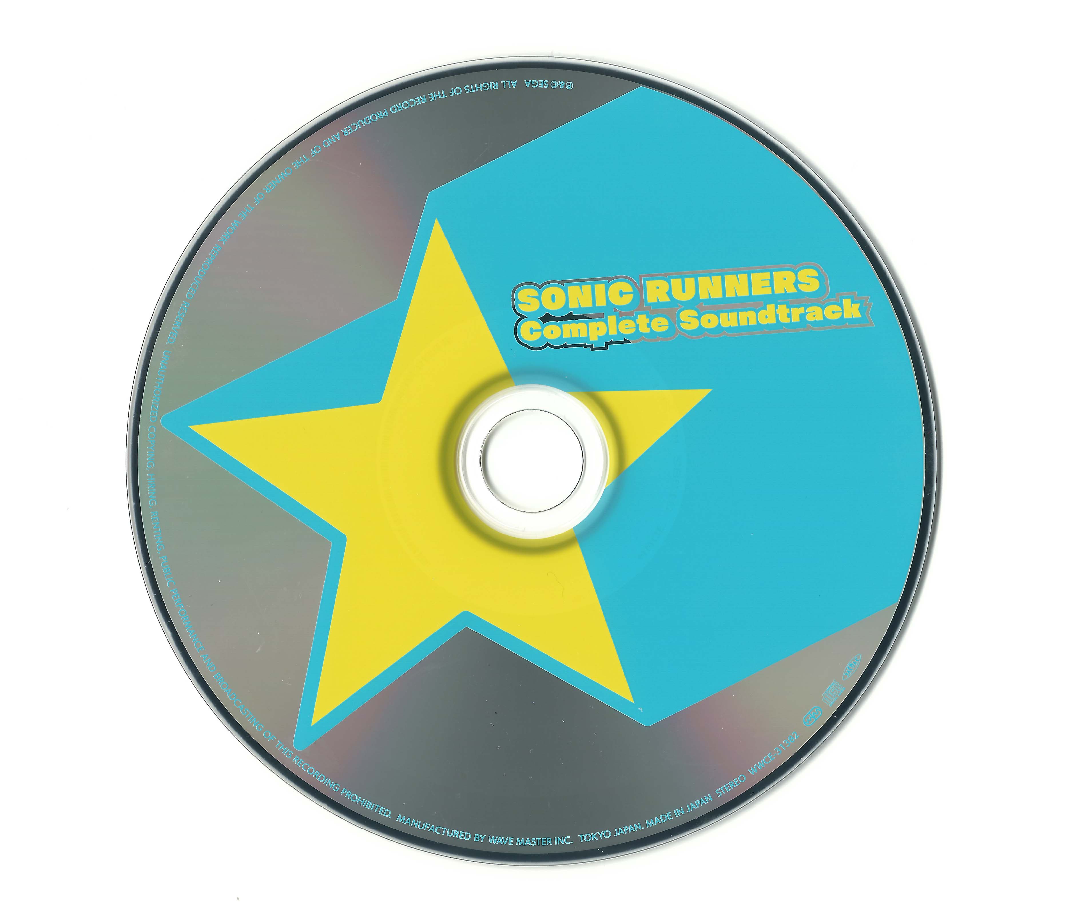
Very interesting piece of Sonic history, but that won't save it from that disgusting blue.
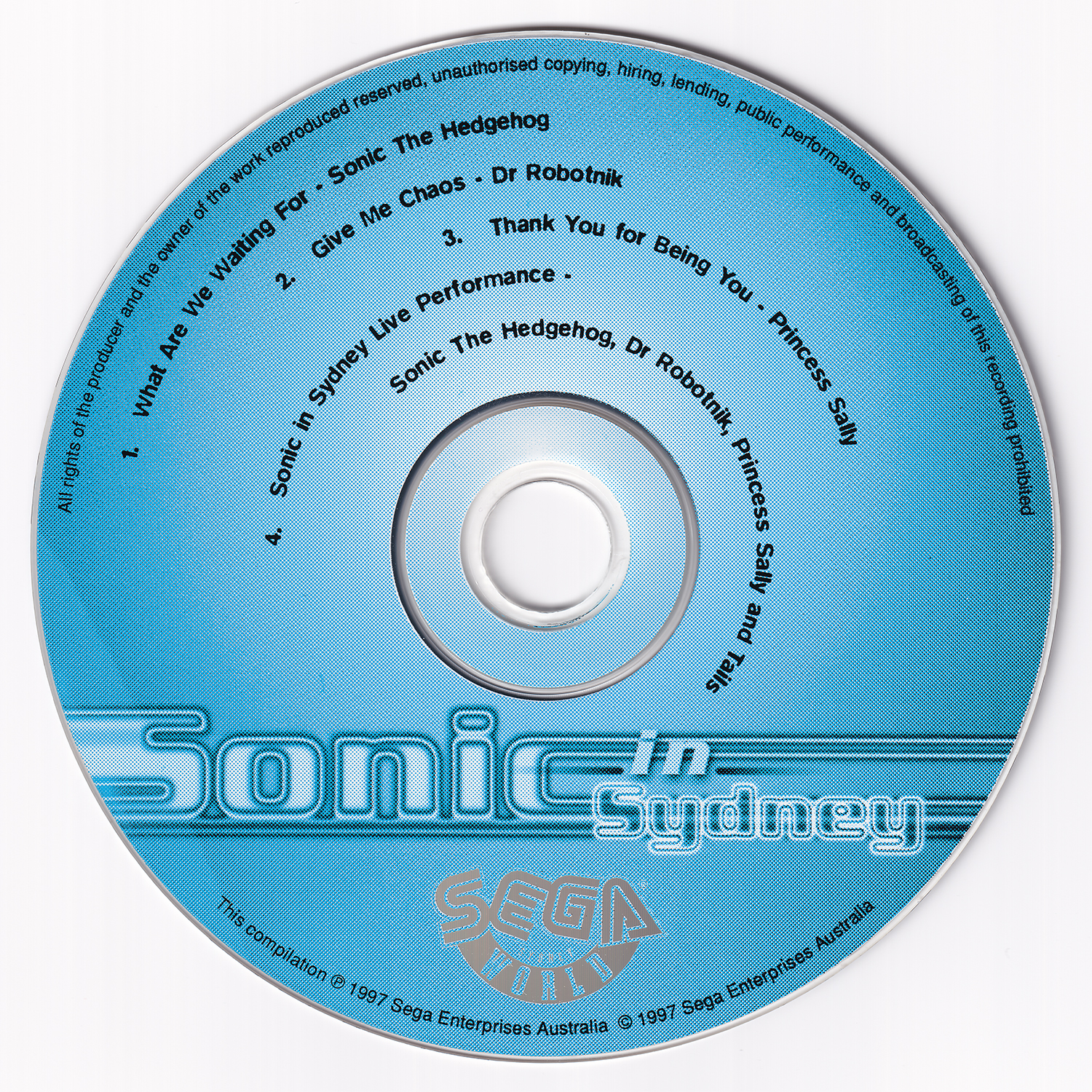
This one however, got saved by its text. Just amazing.
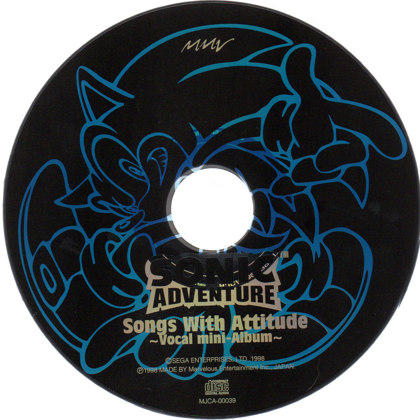
Oooh, this one. That rad Uekawa Sonic filling up the disc, the shiny logo, the charming text, yeah, what an attitude. Extremely cool.
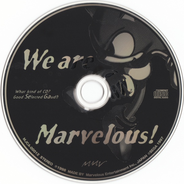
Sometimes, minimalism just works. I like it. Very clean and confident white on black.
I like the colors on each disc being the reverse of the other. Like the fonts but not a fan of the square look.
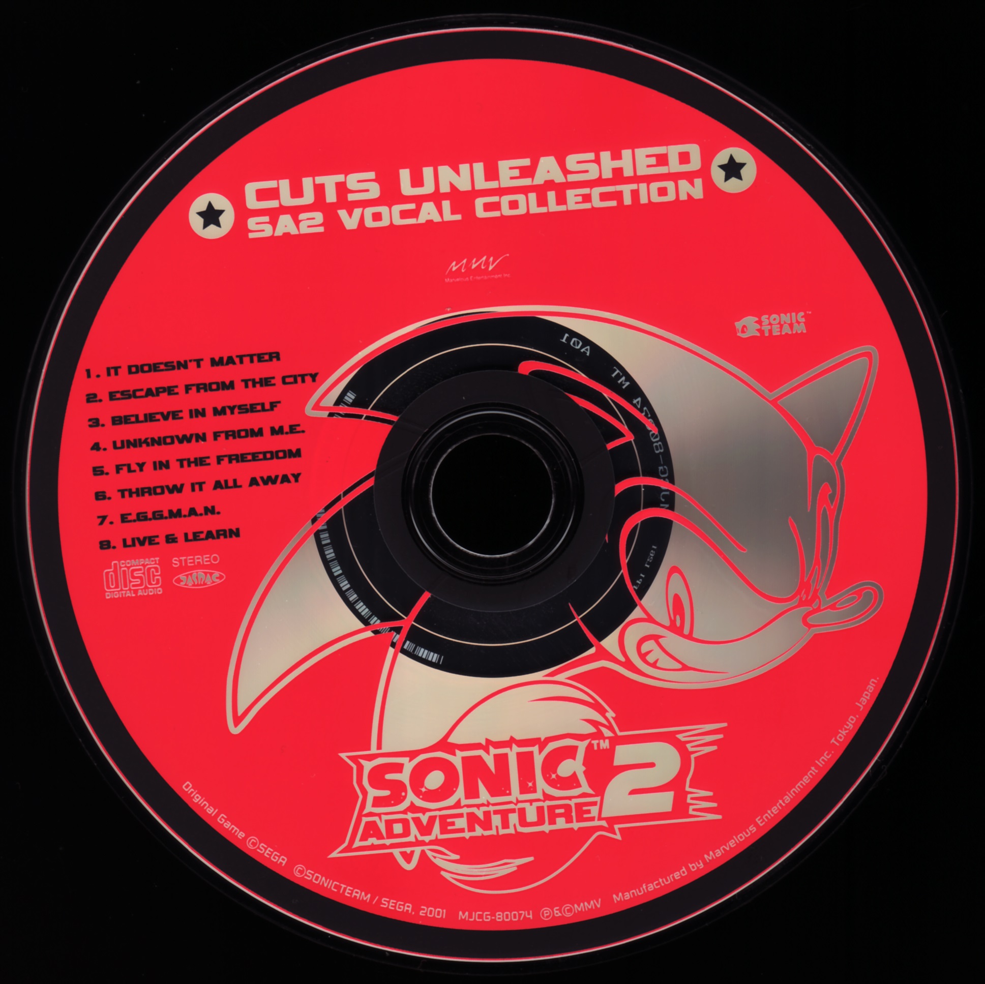
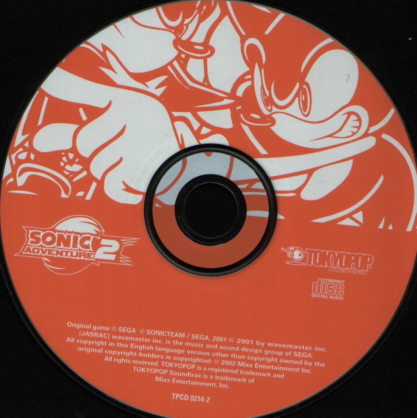
Hey, we haven't reached that Unleashed yet, but I'm forigiving you disc because you look very cool. Can't go wrong with Uekawa, a great gold/black/red color scheme that grabs the attention, rad SA2 font and stars.
This is it. Symmetrical poses, color combos representing each character while also working great on their own, cool as fuck shiny lineart, rad SA2 font, details such as the text inverting colors when touching Shadow's quill, just Uekawa in general. I can go on and on. The rating answers it best.
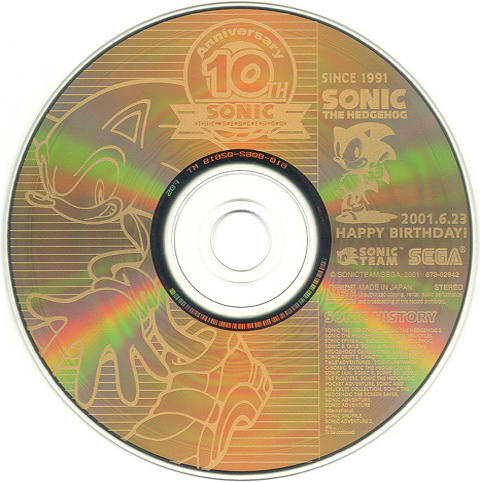
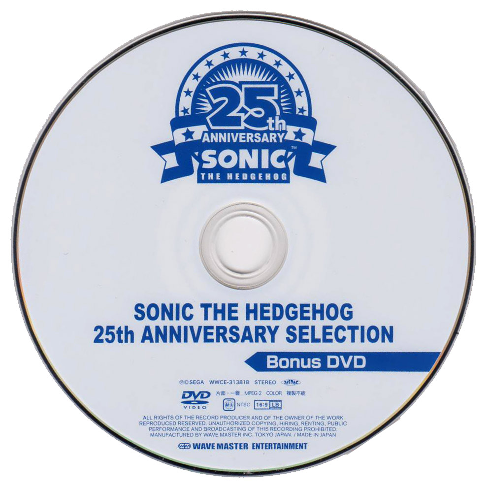
All of that celebratory gold makes it hard to see, but my boy deserves it. Both classic and SA2 Sonic on the same disc makes me somewhat warm and fuzzy in the inside. All of that birthday text is cluttered though, and not a fan of the horizontal lines.
Oh my oh my, pretty fantastic as well. Red and white always looks great. Somehow, cutting off that art makes it look cooler. Peak graphic design.
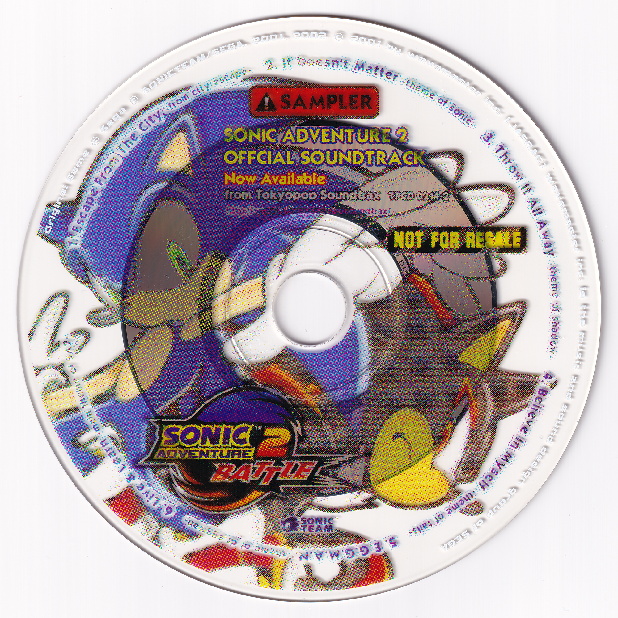
No idea if it's the scan or the disc looks like this. Best I could find. Kinda like the "NOT FOR RESALE" and "SAMPLER" text, reminds me of a different time. No I never saw a sampler disc in real life. Cool fonts too, but this is hard to look at.
Simple, yet clean and effective. The rainbow shine is a nice touch.
This is just the previous disc but less cool. Zoomed in logo looks better. Not a fan of that blue, too.
Much better minimalism. Black on yellow looks rad in all situations. Just having the logo on the bottom oozes confidence.
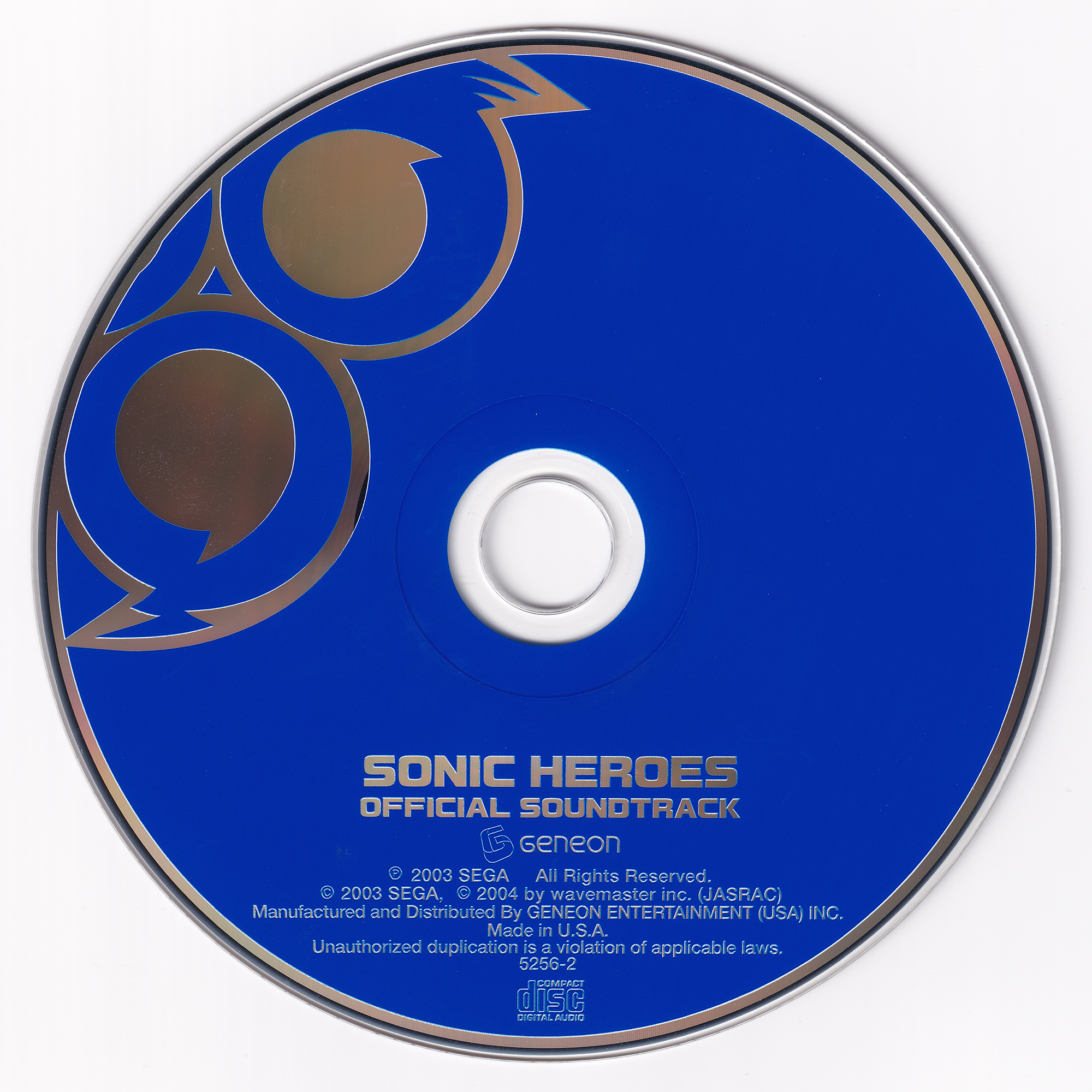
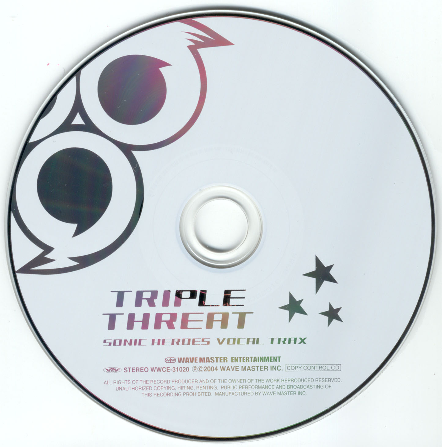
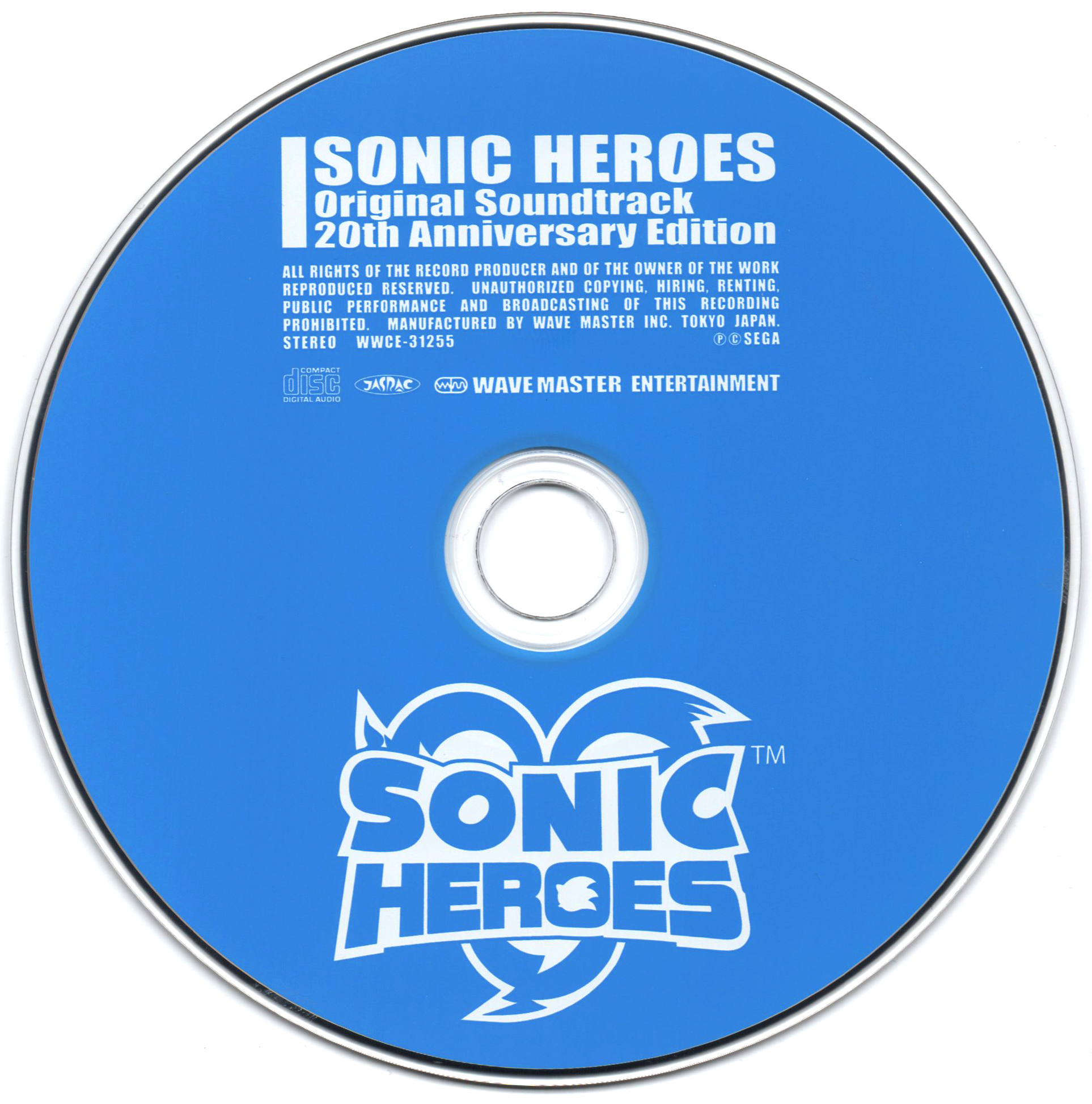
Why do all of the Sonic Heroes discs copy each other. Fuck consistency I want cool! Just a worse Triple Threat disc, again. It doesn't look bad at all it just gets less points for being the same.
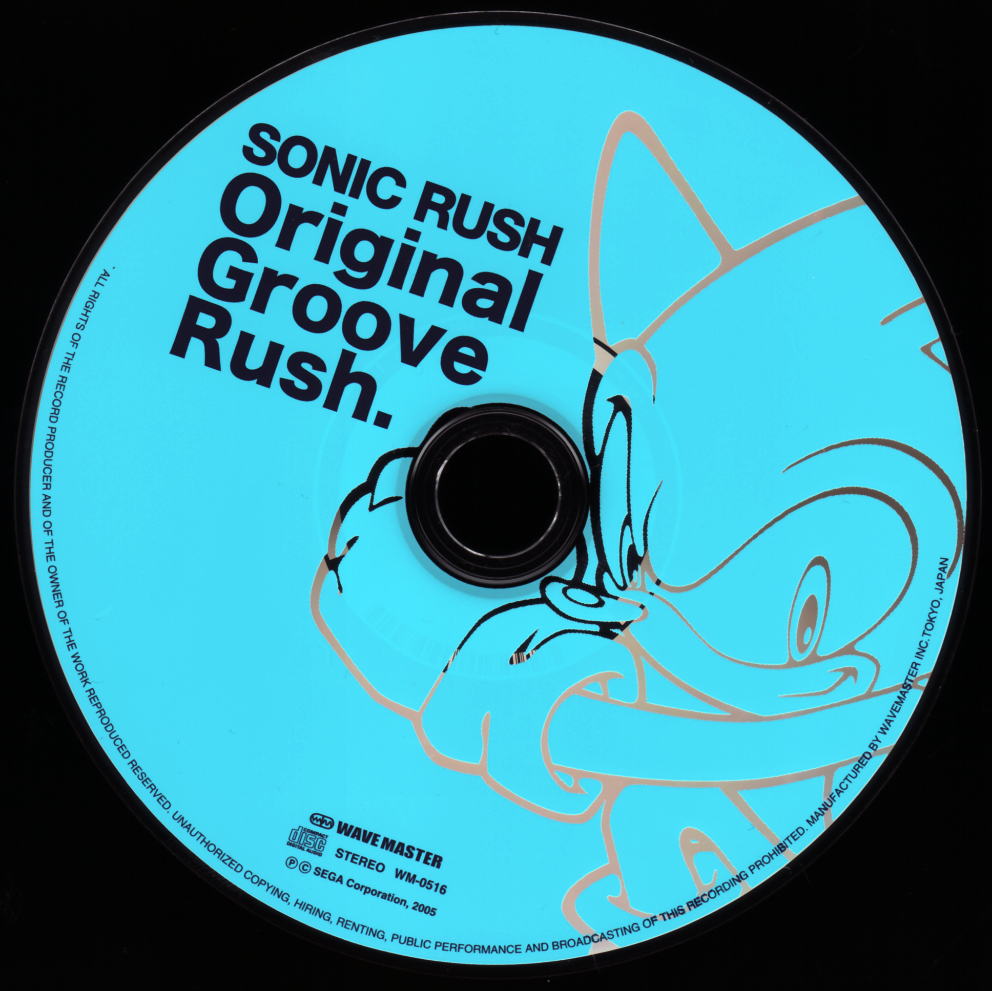
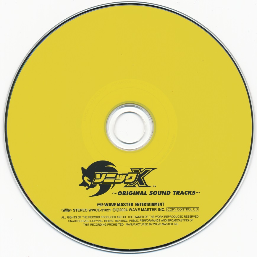
Hnng shiny Uekawa and cool bold font, but, that lame blue though.
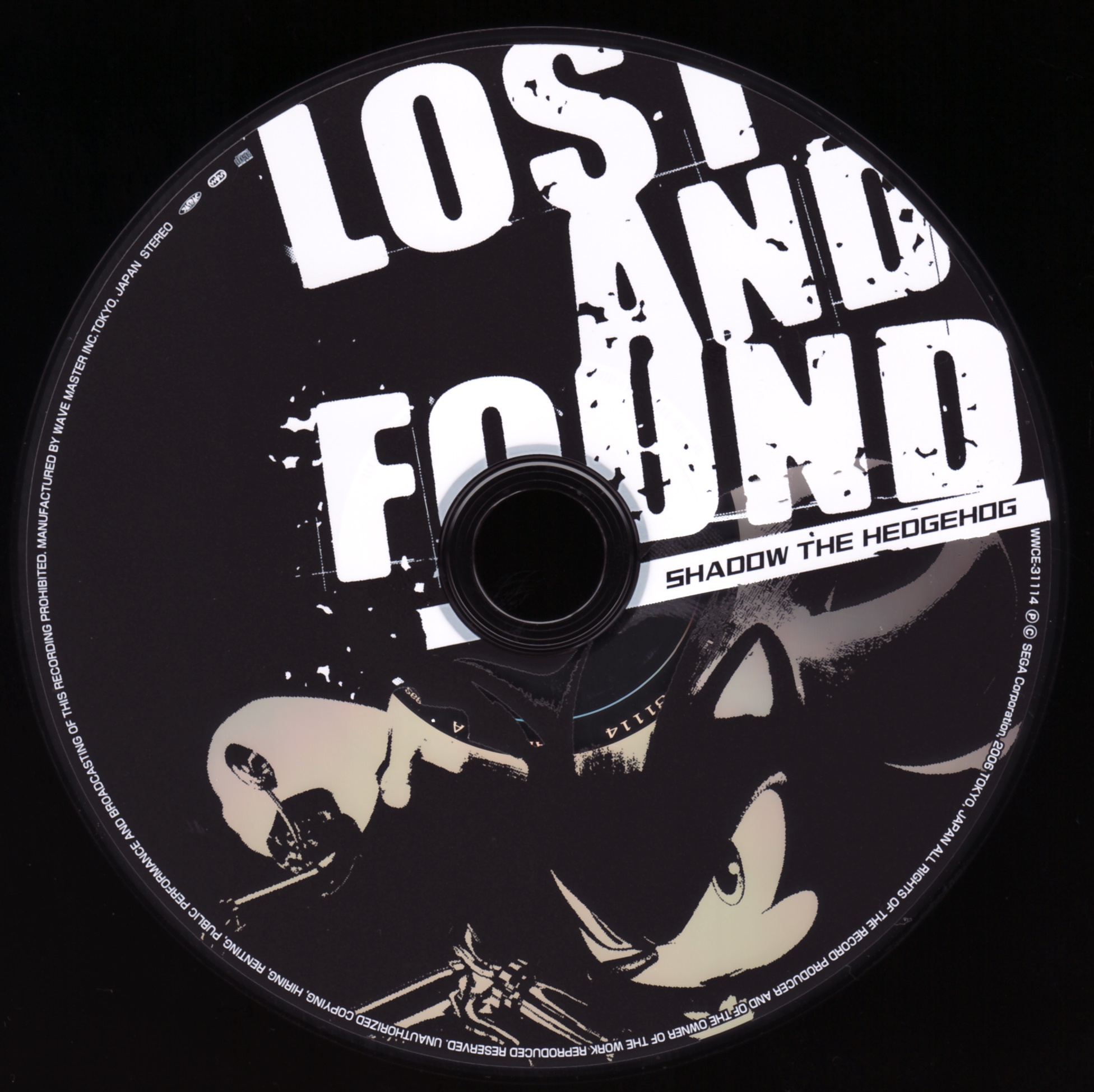
I actually love how over the top the Shadow the Hedgehog aesthetic is. Great composition, beige Shadow is rad, and the edgy logo is actually cool fuck you if you dissagree I will put a lovely pipe bomb in your mailbox
As cool as the X disc but with a cooler colorscheme. I'm sorry I just love red.
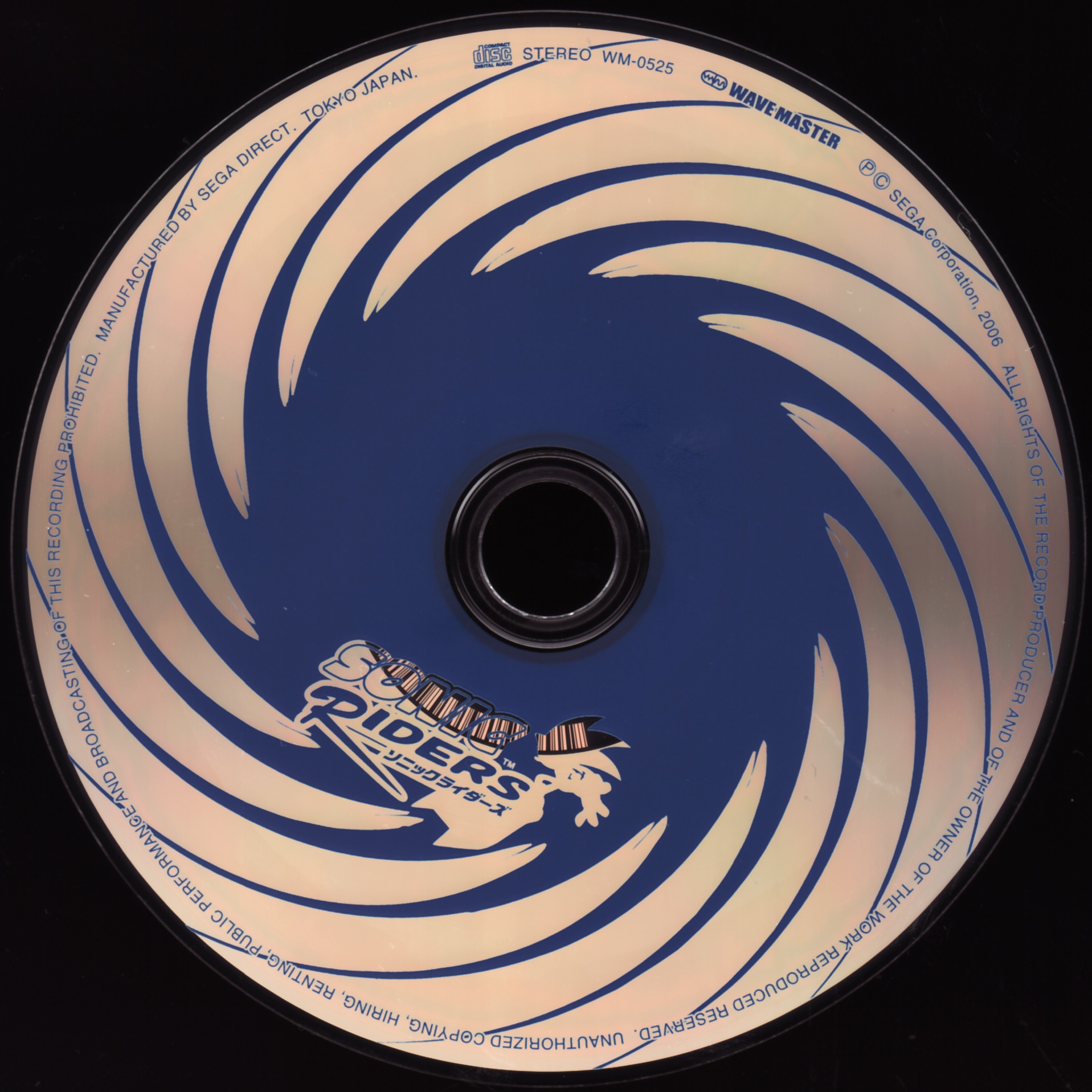
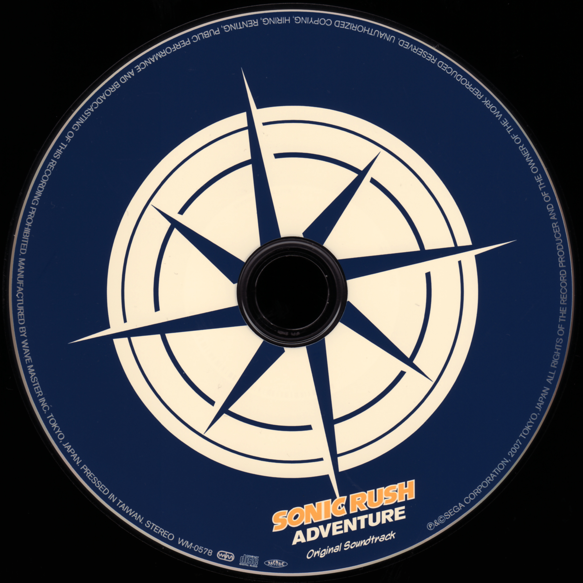
It's shit like the disc looking like the air in Riders that tells me the designer played the game, bonus points for that. Clean shiny is good too.
The disc on its own is pretty good. I love red in general, and the exaggerated fonts are pretty cool. What propels it to 10/10, is the tray. Omega is just fucking pissed at the disc I love it so much. But you're not supposed to review the trays, only the discs, that's cheating! Yes. I will cheat and kill for my boy Omega.
This is mwah. Love the bold outline and the logo in itself. The lines keep it from being too boring and compliment it. The character colorschemes look great.
Not sure if it's the scan but this is hard to read. I appreaciate what they were going for and it looks cool, just kinda too busy.
I like this a looot. Great way to take advantage of the disc hole, whatever it's called. Only problem with it is the bottom font, doesn't look too good.
Grouping these two together for obvious reasons. The discs, aren't very good. Only bonus points are for that one Sonic standing there. Underground logo looks pretty fine too.
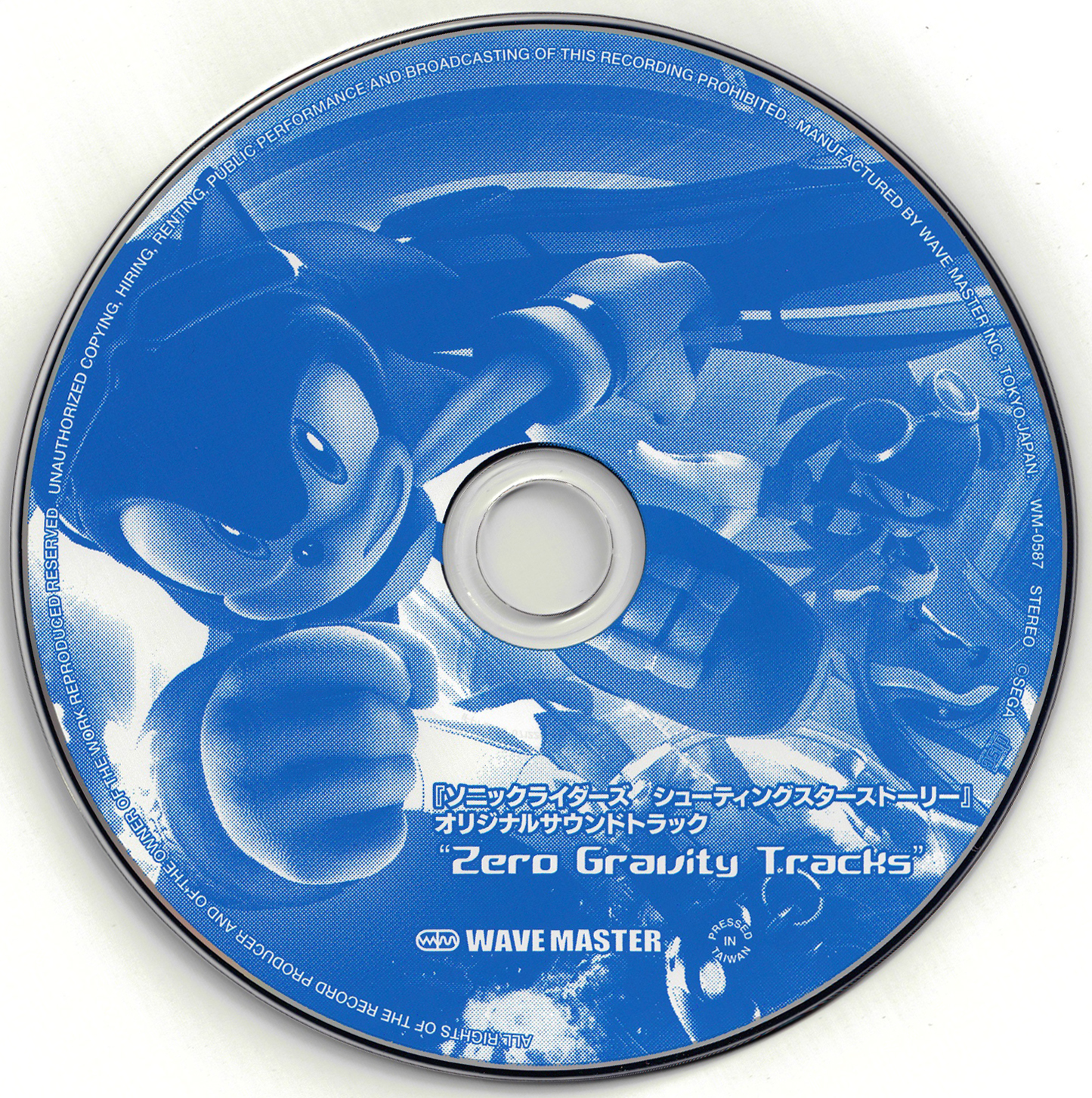
Really dislike this one. Just the boxart in fugly blue, didn't try at all. Looks bad especially compared to the other Riders discs.
Ugly.
Dissapointing discs for my favorite Sonic OST. Doesn't represent the game very well, don't like the horizontal lines on the characters, fonts aren't that good. Also that fucking Chip render. I hate it so much I want to launch him into the sun.
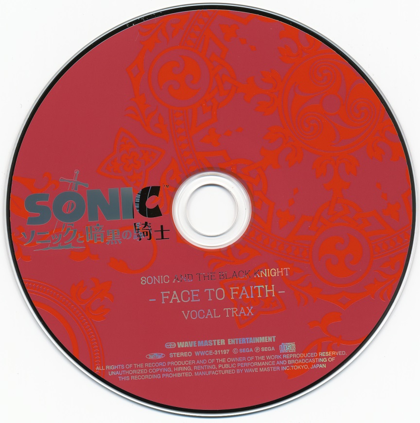
Thank you Sonic and the Black Knight for bringing quality back. Won't talk about how I love red, well I guess I just did. Just look at those celtic style markings. Gorgeous. 10/10. Also cool shining logo and nice fonts.
Repeat of what I said above. Just like the colors a bit less.
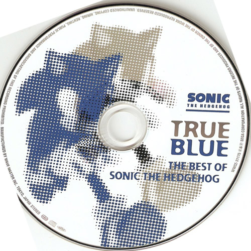
Much better than the True Blue disc. That star logo is perfect for a disc, and while I don't like the fonts very much I like the effect on them.
Didn't play the game so i don't know what the markings represent, but they look great. Great way to take advantage of the disc hole. Same fonts as the game, I like that. On par with the Riders disc.
Pretty lame honestly. The color splashes are a nice touch but don't like it much.
For some reason this minimalism feels lamer than the others. Maybe it's the placement of everything. I like the shine and fonts though.
Same as above but with red so an extra point.
Same as above and above above but with a worse looking blue. Minus a point for that.
Feels like what the Colors disc was trying to do but well done. Also, missed classic a bit there. I don't miss him in boost games.
I guess it fits but I just don't like the Generations artstyle.
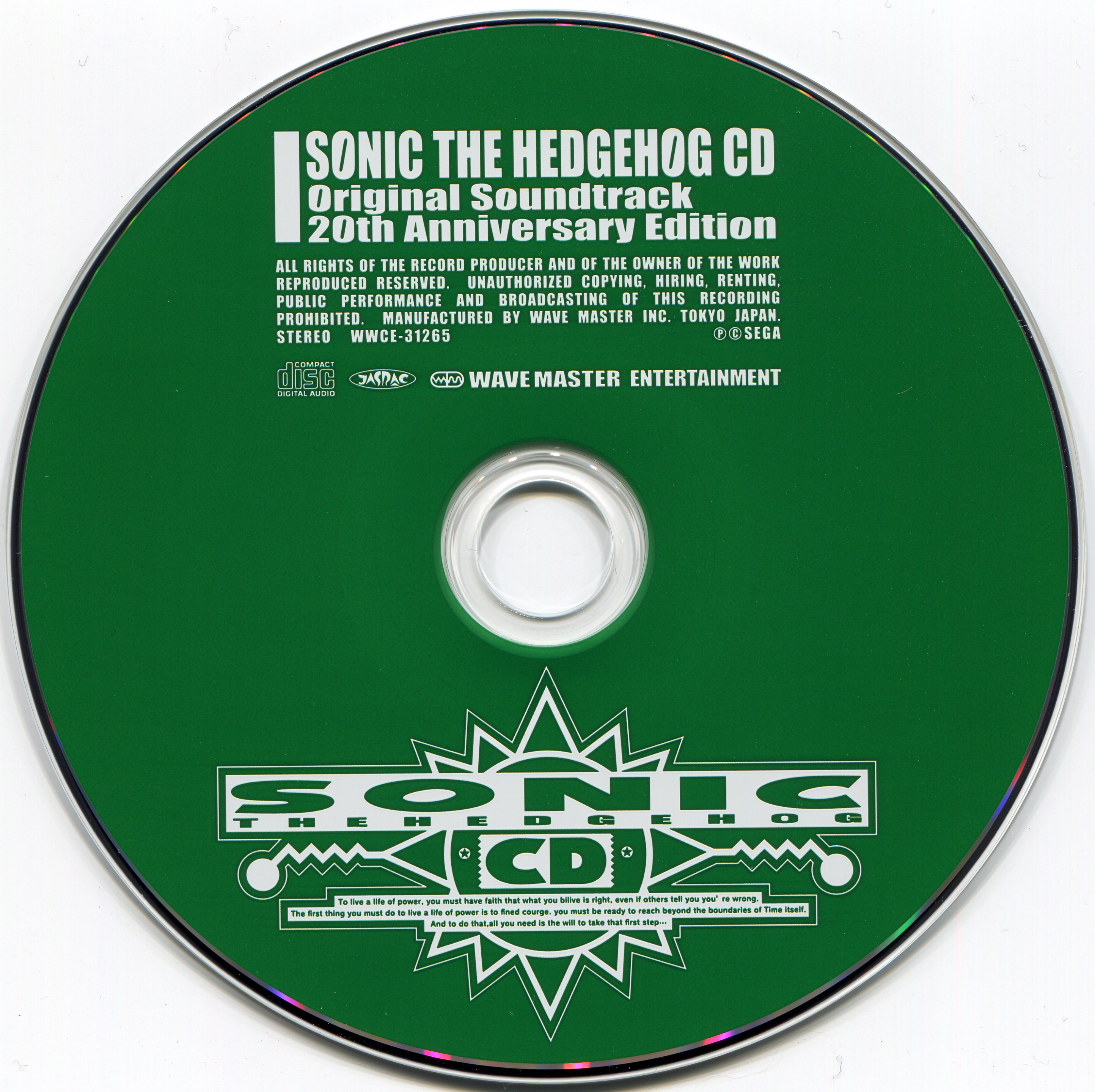
Same as 3 times above and above above and above above above. Though the CD logo looks cool in general.
A much better way to pull off the Generations artstyle. Doesn't actually look boring and the renders are quite dynamic. First disc looks better than the second.
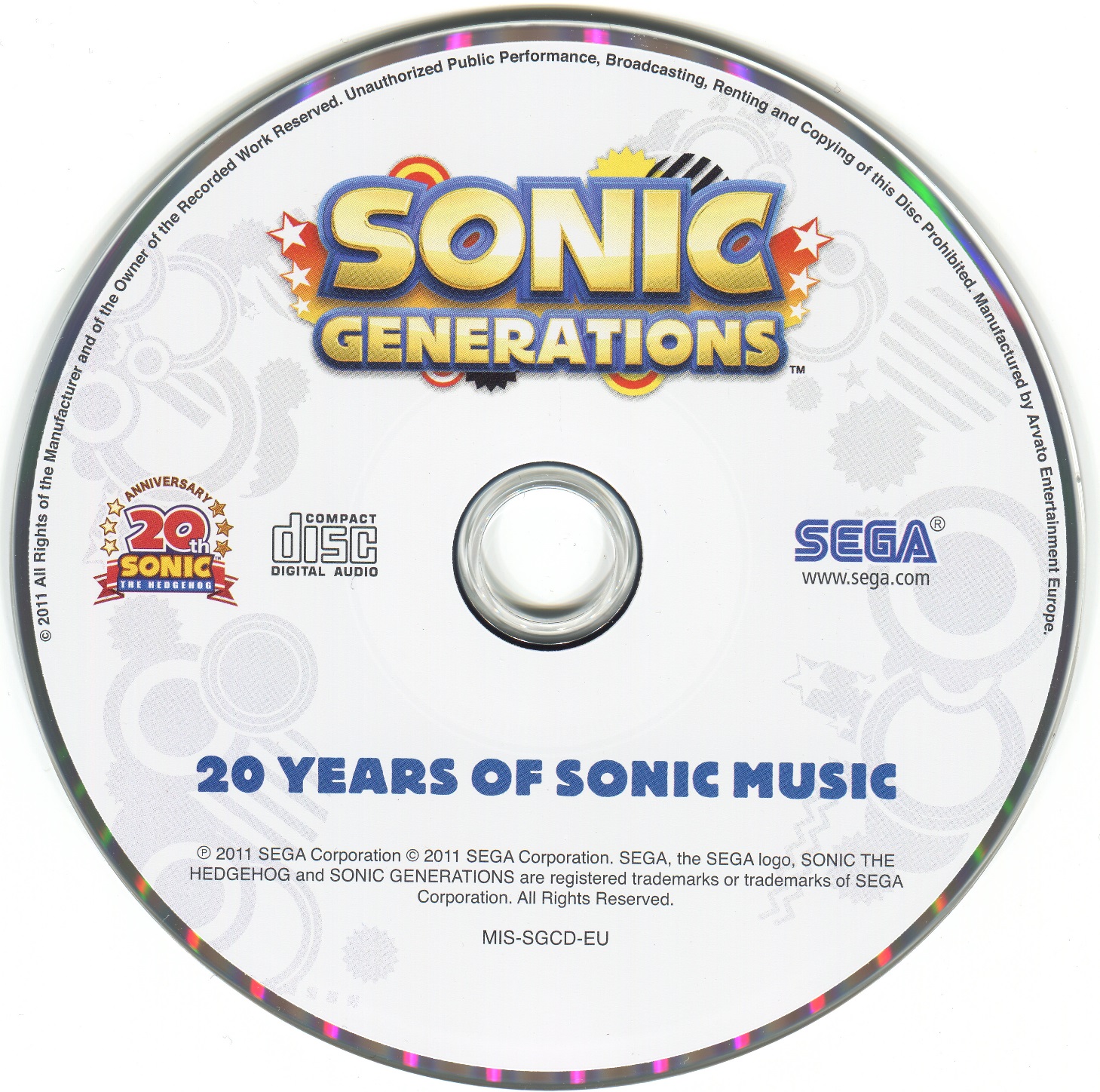
What's with 20th anniversary discs and looking boring. It's the same as 2 times above and above abo- I won't even bother this time.
It's just boring, again and again. Yeah different color schemes but it's just generic stars again. Nothing bold. They managed to make red look lame!
As nostalgia bait as the actual game. Nah seriously, this would be an okay disc for Sonic 1, but I wish they were colors or something.
Boring but not bad. I like the fonts.
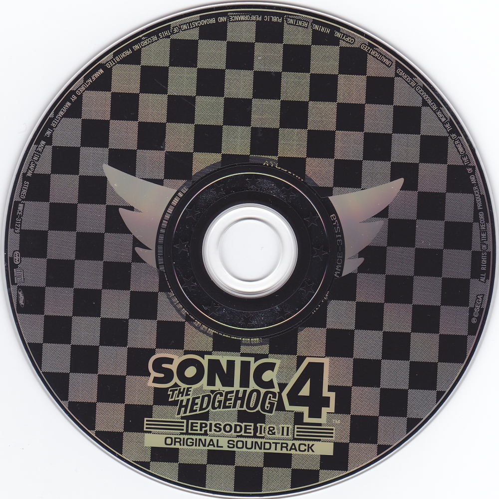
Some of these colorschemes are vomit inducing. Also lazily slapped renders. I guess I like the big number design they were going for but bad execution.
Oh I actually like this one. Pretty tired of white and blue, but this is cool. Like the clean and bold style. A bit off-topic, but what is that comic book style dot thing called? I seriously don't know.
This doesn't look bad, it's just boring, again. Common theme for the 2010s eh? Also the mix of 2D and 3D renders at the top just sucks.
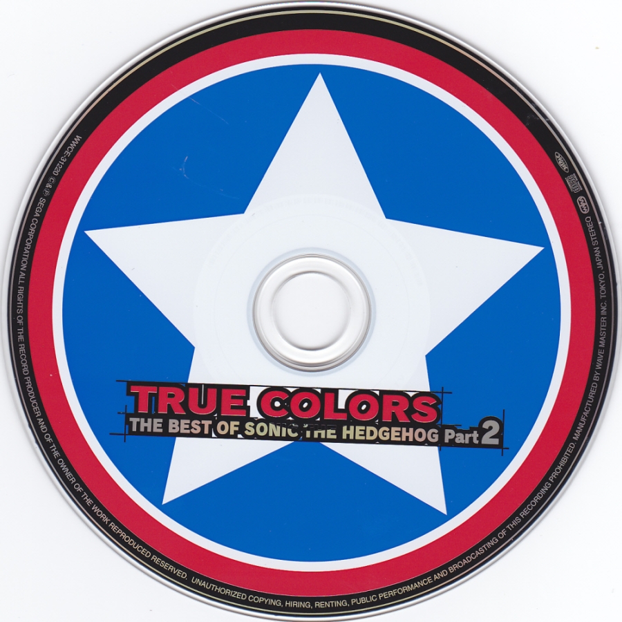
Finally some more creative minimalism! Wish it represented the Adventure era better though. Stars for decoration (almost) always look good. Also red. Hmm. Nice.
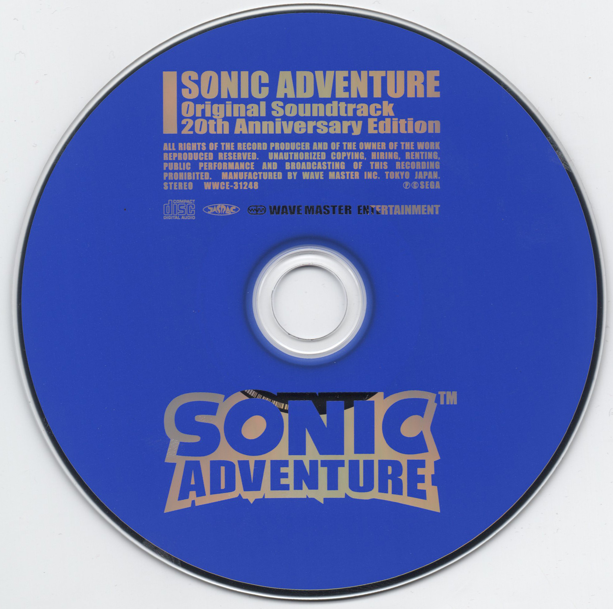
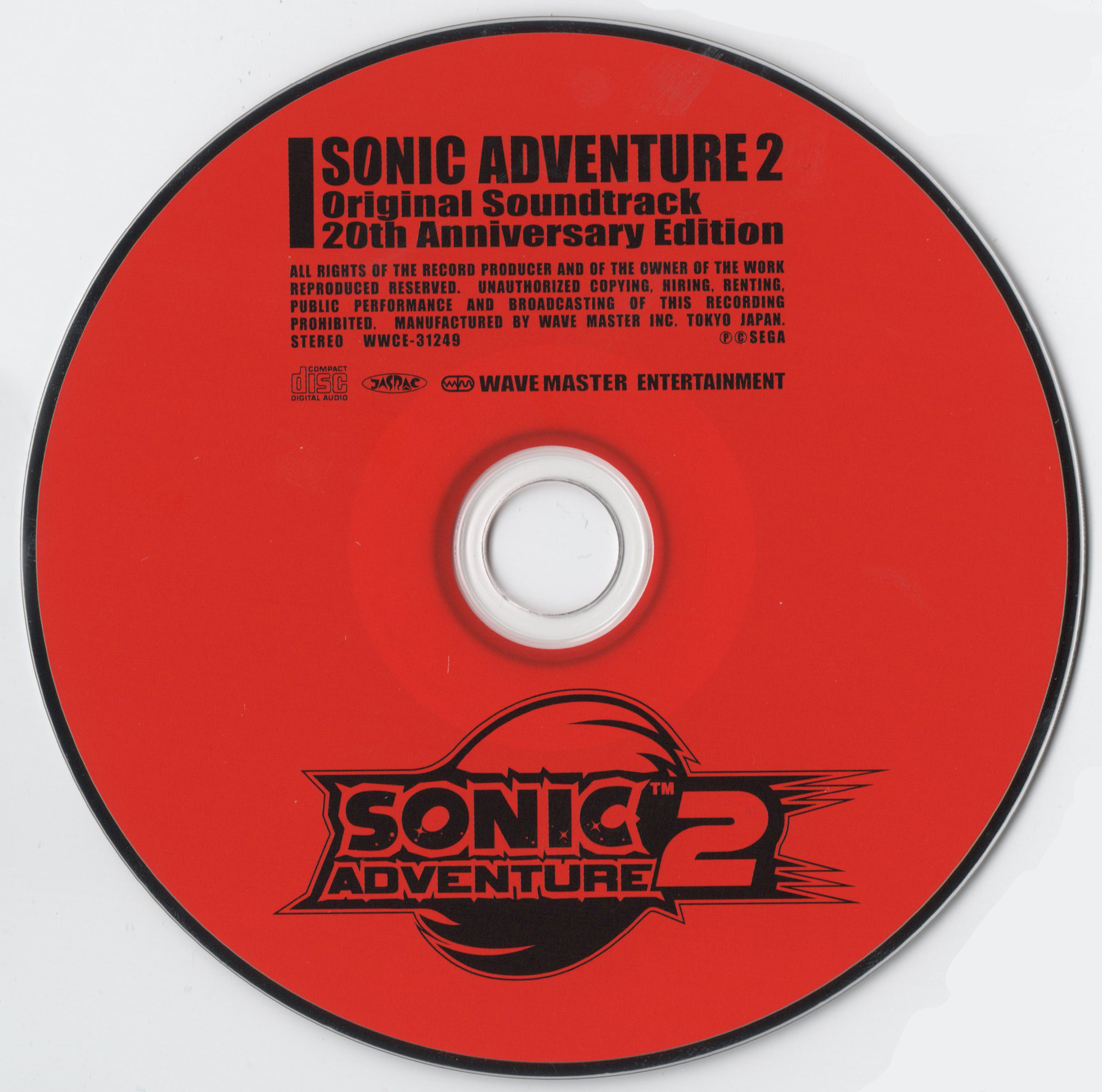
This is a much better representation of the Adventure era, can't go wrong with that pose. Even with the outline alone you exactly know what that is. Also reverse colorscheme between 2 discs is always nice. Bold confident font, too.
Blue and white minimalism again. I have so much to say!
I have the same opinion as the Blue Blur Generations disc one, but extra points for better font.
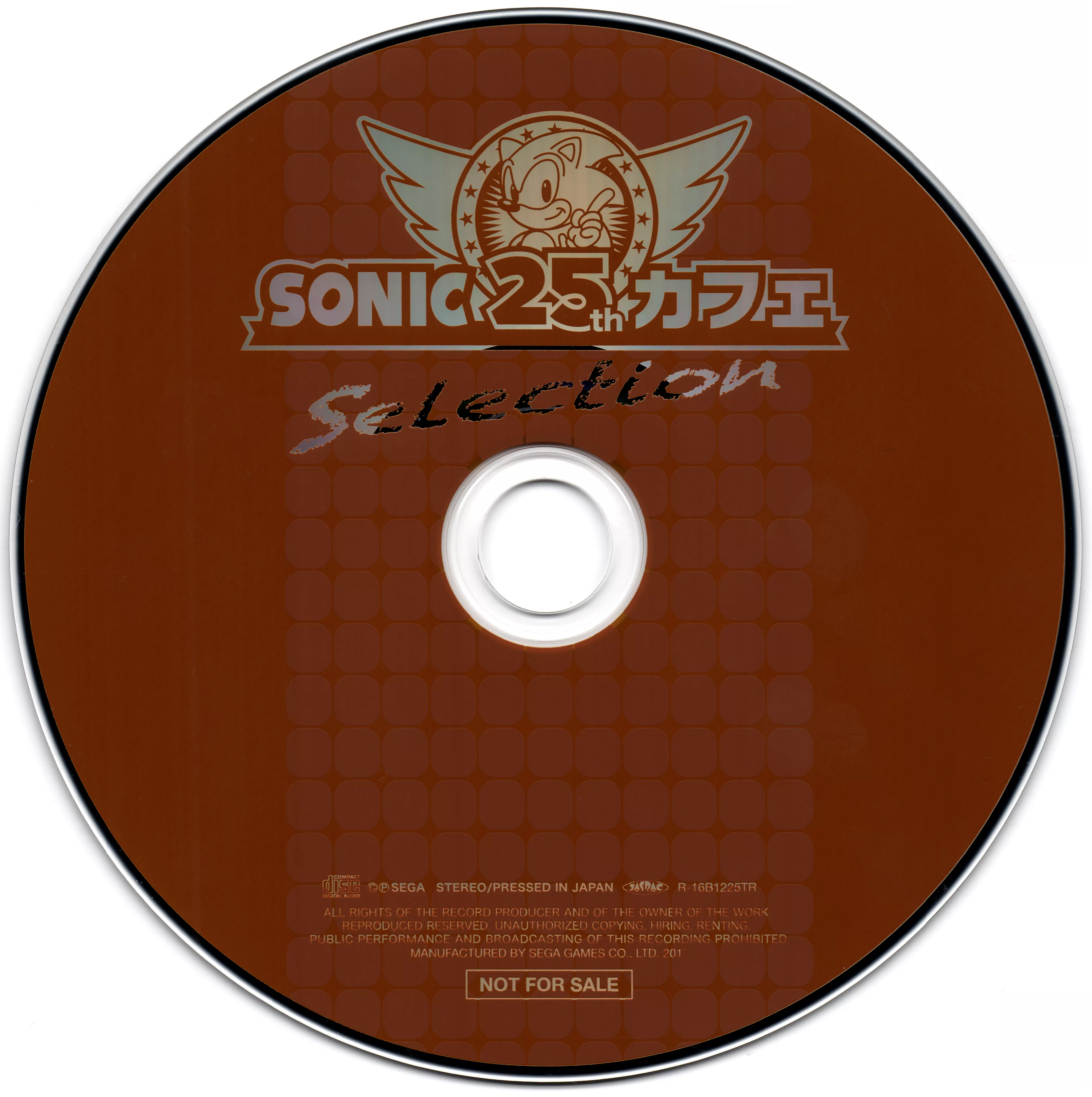
This feels like coffee, and as I'm writing this, I'm going to get up and grab a coffee because it gave me the want for one.
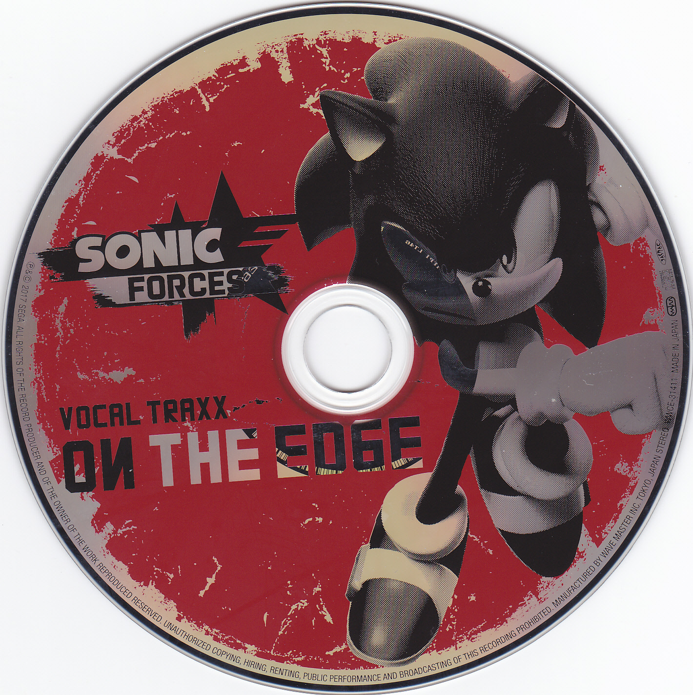
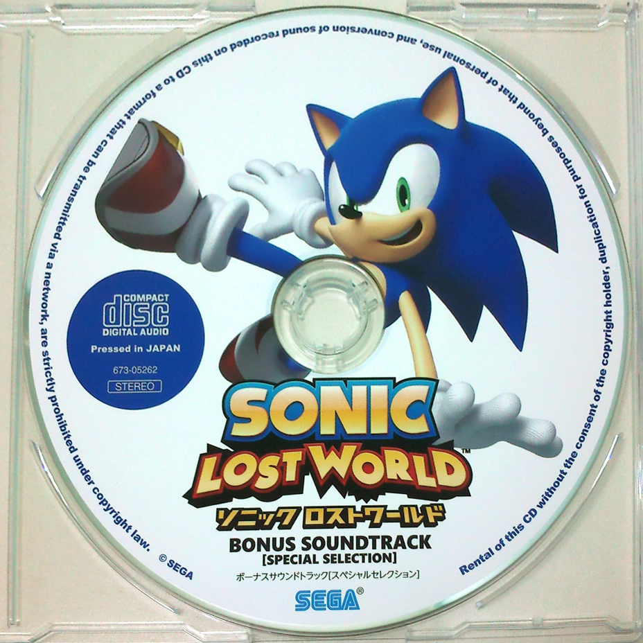
Hey this actually looks rad. Like the "used" effect a lot. No idea why it looks like that in the middle, maybe because of the scan? Sonic Forces has a nice colorscheme and artstyle, shame it was wasted on itself.
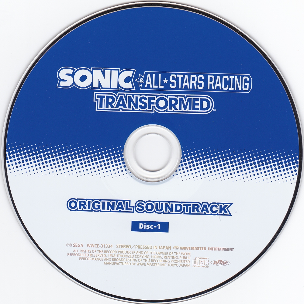
Beige and resistance logo for the first disc isn't too appealing. For the second, I love the red and Eggman logo, because red and rad Eggman logo. Infinite has a nice logo too, but I don't like white that much. Bold fonts are always a bonus for me. Dunno why some letters are reverse though.
I feel like this is a nice idea, silhouette stage and characters can look good. But meh execution. Character renders in the two discs are the same, and I just don't like the font.
Nice looking primary colors, bold font and logo. Good minimalism. But the boring type of it. I'm getting really tired of it at this point but I'm almost done.
Bad.
And I'm finally done. Good lord. Kept repeating myself because there are so many. Since I tried to find the highest quality scans of everything you can use this a resource to have everything in one place. Oh yeah and the title might be bait who knows.
- Gap